A landing page can be a lot of different things.
A landing page can be the introduction to your product. It can be the space where a user makes like Fry from Futurama and proudly proclaims, “take all of my money.” It can simply be a vehicle to gather leads via email.
As a WordPress user, you know that you have access to a platform that is highly customizable with themes and plugins, but you may not know where to go when designing the best landing page. Learn about overall landing page practices as well as specific strategy for select types of landing pages, from the front page to the checkout page.
Front Page landing page design
“I want that website.”
“Wow.”
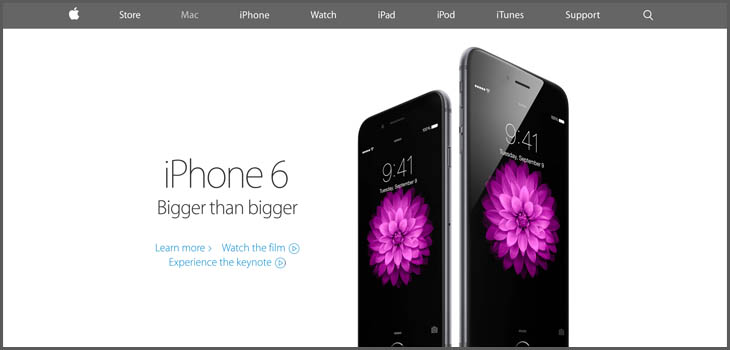
You don’t need to be a web developer or designer. When you visit a website, you should be wowed. You should want that site or want to get in touch with the person who made the site. When you look at examples of awesome website front pages, you should be inspired.
Be yoo-neek
If people are looking for a solution to your problem online — anything from a fully-featured CRM system to an itchy back — they are going to explore their options. It is up to you to make your landing page unique, but without sacrificing exposure to the product.
Landing pages are most effective when they have large images or video to explain the product visually.
Visuals are more powerful than words. Sorry English majors.

Aping the Competition
Those aforementioned websites that you should be wowed by?? Make them the websites of your direct competitors. There are so many different products with different impact points that you should be looking to your “enemies” for inspiration. You will find that many of these more successful competitors have a great front page. Mimic their content layout with your own twist and brand message.
There are a lot of questions you can ask. For example, if a site in your industry is one that encourages multiple sessions, it might be better to focus less time on a giant, interactive front page and more time collecting emails and creating an obvious navigation funnel to log in to the site and view fresh content.
Floating headers everywhere
Another modern design decision for front pages is the floating header. While this is great for focused digital products, if your site has a major blog or has many different products to offer, having a floating header might get in the way of the usability of the site in the long run. Remember, users viewing web content on mobile phones and tablets as their primary device has INCREASED by over 100% for many sites over the past year. Imagine a website on a smaller device with a floating header. Be careful.

Setting up the WordPress Front Page
Setting up a WordPress Front Page is a simple process. If it is not, then it is a very difficult process.
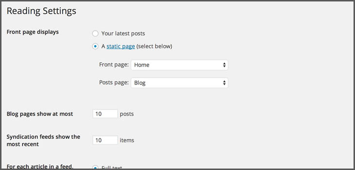
- Create a page called “Home”
- Go to Settings > Reading and select the “Home” page as.. well… the page you would like to use for the home page.
From here, it is just a matter of having the tools ready to design a “yooneek” and elegant site.
This can be in the form of themes that “do giant landing pages for you” like Divi or WordPress themes that have landing page templates and user friendly customization of call-to-actions to make the site your own.
Plugins like Conductor also help to manage exactly how and where you would like to display your content.
Checkout landing page design
You followed our steps on creating a brilliant front page. Butts are getting in the infinite seats that your checkout page supports. Now it is time to convert.
Did you know that on average 68.06% of all people who put your digital good in their shopping cart will NOT complete their purchase?? What gives?
There is human psychology at work. People LOVE putting things in their cart and seeing it within their grasp. Think about going to a Best Buy or walking by an expensive electronics store and looking at the displays. Can’t you see yourself walking home with that product and using it on a daily basis? Then, reality kicks in and you leave the store.
Imagine…
That the ultimate salesman walked up to you as you were cradling that iPad in your arms. He was able to answer your questions, explain the ROI from owning the product, and even make you feel at ease with your wallet.
THIS is what your checkout page should do. There are a few tips to utilize to make this happen. Use psychology against humans.

Button Color that pops
When selecting design for checkout buttons, use colors that are comfortable yet a stark contrast from the rest of the websites. Also, make buttons that are FUN to click. One of the most recent trends is the ghost button. The reason it works is because ghost buttons are so much fun to click, and could help with checkout conversion.
Sweet Solitude
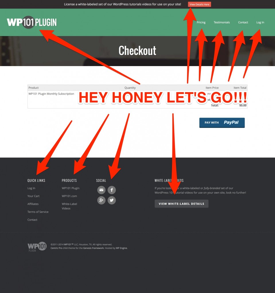
Imagine you are looking at that iPad and are ready to make your purchase, when you bump into another customer. Perhaps your significant tells you it is time to leave. With the Internet, this comes in the form of the header, the link to the blog, or other stuff that gets in the way of making the singular decision of purchase.
Use page templates with no header or other content to get in the way of capturing the purpose.
Creating an email marketing landing page
One of the best ways to ensure purchase and happy customers is the email list. For years, blog posts have been a broken record about the effectiveness of email marketing, but it is because they work well when managed properly. So how do you get someone to your list? Well.. You start with Gravity Forms and MailChimp and then move from there.
Opt-In Monster
In last week’s article about web design in 2015, we referenced Opt-In Monster as a great tool to collect emails for your email marketing campaign.
The beauty of Opt-In Monster is that it is a plugin that can turn any or all of your WordPress pages into an unmistakable call-to-action. Installation and setup of the product is easy. Opt-in Monster will allow you to place a gigantic, moving call-to-action to join an email list. This can then be attached to popular services like Constant Contact or MailChimp.
Themes to make a WordPress landing page
If you are looking to make brilliant landing pages, there are themes that you can use to accomplish this. Look for themes that support specific page templates or look for plugins that are theme agnostic to allow for better control of display of your content.
Modern Business Pro
The Modern Business Pro theme comes with widget areas for the header area and front page sliders and content. It also support custom page layouts, so you can change your front page or landing page from sidebar to full width easily.

Full-width landing pages with no header
All of our Slocum Themes include a full-width landing page template like we referenced in the section on checkout pages, so that you can focus the page on the content and conversion and NOTHING ELSE.
How to Access Slocum Themes Landing Page
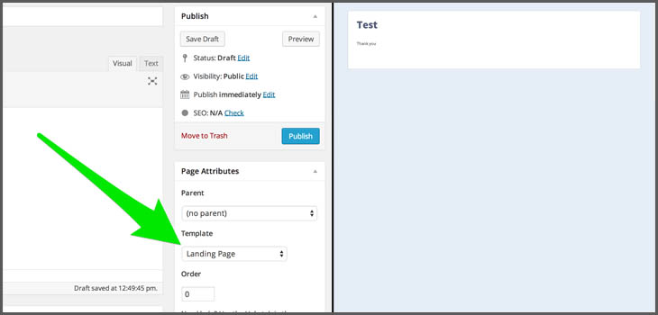
When editing or creating a new page, like a checkout page or other landing page, look for the “Page Attributes” section. With our theme activated, you would select the “Landing Page” template option.
The page will now display as a full-width landing page with no header or sidebar to allow a user to focus on the content in the page. This could again be used for the purposes of membership, checkout, or information.
Best WordPress Landing Page Design: Tips and Tools