2016年2月29日星期一

Reducing Bounce and Exit Rates


Your site is up, and your product is out there for the world to see. Before you know it, you have visitors trickling in to see what you have to offer.


Despite the depths of the Internet and the billions of pages offered, users are arriving at your website, and then without any explanation—they’re leaving.


They come and then they go, maybe after a minute, maybe even less. After all of the hours you’ve put in, the majority of your visitors aren’t staying around long enough to get past your landing page. Many of them visit once and never return.


Do not immediately move through the five steps of grief; in this chapter we’re going to go over some ways to change this trend for the better. Tweet this!


In Chapter 1, we touched briefly on your Bounce and Exit Rates. In this chapter we’ll look at these numbers in much more detail. First, let’s review those key terms.


Exit Rate

An Exit Rate is specific to each page; it’s the percentage of people who leave after viewing the page. Your exit rate lets you know the last page that users view before they move on. A very high exit rate on a specific page can be a red flag.


For example, if your product tour page that details the benefits of what you sell has one of the highest exit rates, you are likely not connecting the true value of your product with your visitors.


Bounce Rate

Your Bounce Rate is the number of visitors who leave your website after visiting a single page. Each page has its own bounce rate, but initially you probably want to address look at the bounce rates for three pages:


  • Landing pages that you’re sending paid traffic to through ads

  • Pages where you are attempting to make conversions happen

  • High traffic pages–pages that most of your visitors see

The higher your bounce rate, the lower your percentage of engaged users. Your bounce rate can be affected by your page, but also by the quality of the traffic coming to your site.


All of the following ways of leaving your site constitute a bounce:


  • Hit the back button

  • Type a different URL

  • Close the window or tab

  • Click on an external link

  • Timeout [1]

But how do you find your bounce rate?


This is where your analytics come in. We touched briefly on analytics in Chapters 1 and 4, and we’ll discuss them in much more detail in Chapter 9, but for the sake of our discussion of bounce rates, we’re going to mention them again. They are that important.


A basic analytics report will give you an overall bounce rate, with options to dig deeper and find out the bounce rates for individual pages. In Google Analytics, you’ll find this by going to Content > Site Content > Pages.


Once you have a grasp of what your bounce rate is, it’s time to figure out why visitors aren’t sticking around in the first place.


Your toolbox for determining what’s causing your high bounce rate contains many of same tools we discussed in Chapter 4. Again, we’ll discuss these at length in Chapter 9, but the basics are as follows.


  • Analytics – Figure out bounce rate and traffic sources for your most popular pages. Your website’s overall bounce rate is too vague a number. A detailed page-level report will help you identify your highest traffic pages and your worst offenders when it comes to bounce rates. Analytics also delivers insights regarding where this traffic is coming from.

  • User Testing – Figure out what users are doing on your site. The ability to observe how users interact with your site is invaluable in determining the cause of high bounce rates. Using a CrazyEgg heatmap might reveal that only 30% of visitors see your call to action.

  • User Surveys – Ask users what they are looking for and whether they can find it. Analytics and testing will only tell you so much. Some stuff you can only figure out by asking visitors directly.

Here are some of the most common culprits:


  • Your website is visually unappealing. Sometimes the fix is obvious. A visitor has stumbled across your site, and they are unimpressed by your cheesy stock images and choice of Comic Sans as a font. Never underestimate the power of an attractive, easy-on-the-eyes website compared to a cluttered eye-sore. Great design creates credibility.

  • Your website is difficult to use. Maybe your site copy makes perfect sense to you, but visitors are left confused or, even worse, offended. It could also be that users are not visiting more pages because they can’t find them. Either because of poor layout, poor information architecture, technical errors, or malfunctioning buttons and page errors, users are left stranded.

  • Your website doesn’t meet user expectations. Unlike in the previous scenario, in which the user can’t easily leave the landing page, in this situation someone visits your website based on a promise that isn’t kept. If you do offer what they’re looking for it might not be easily located from the page they landed on. Users lack the motivation or time to scour every page you have, so it is crucial to remove the obstacles that cause them to give up and look elsewhere.

  • The people coming to your website aren’t the right people. The type of person viewing the page is just as important–if not more so–than the page itself. If people are bouncing it may be because they arrived based on a false promise. This is traffic you can’t really optimize, because they are going to bounce regardless. To avoid this, be sure your ads accurately represent your product and keywords align with your site’s mission.

  • There is no Call to Action. This issue is quite comparable to to the “lack of usability/navigation” issue, though likely even more detrimental to your bounce rate. Users arrive to your site one way or another, and simply don’t know where to go next—the shopping cart is nowhere to be found, it’s not clear how to subscribe to your blog, etc. Whatever the activity you’ve designated as conversion, if the user has no idea what you want them to do, there is a huge problem.
    For example…

    You own a sporting goods store that’s having an awesome sale on fishing reels. You advertise in the newspaper, put banners on the storefront, and send out a mass email. The turnout is great! A thousand customers show up, but only ten customers are able to locate the reels on your cluttered, disorganized sales floor.


    The remainder is left alone at sea, struggling (mind the pun), and more often than not, this struggle is all it takes to make your customer head for your competitor across the street (whose fishing reels are prominently displayed in the front window).

    This is how e-commerce works, except it’s far easier to make a few clicks over to the competitor compared to crossing the street. If you’re making it hard for your users to take advantage of what you’re offering them, you’re essentially sending that competitor business.


  • Too Many Calls to Action (the flip-side of the “No Call to Action” coin). After reading about the last issue, it may seem impossible to offer too many calls to action, but this is quite often the case. On a site with too many calls to action, the user is overwhelmed by the possibilities—buttons and links are everywhere, and the user has no idea which one will deliver whatever it is he or she is looking for. Before you know it, they are seeking the comfort of a simpler, less cluttered site.[2] Tweet this!


Do not get bogged down by all of the negative though. For each potential reason for a user to bounce, there are a number of fixes to help guarantee future users stick around.


When attempting to lower your bounce rate, keep your conversion goals in mind—what exactly is it you want users to do? You aren’t lowering bounce rates because bounce rate are inherently bad. You’re lowering bounce rates so people stick around long enough to subscribe to your email newsletter, download a document, make a purchase, and so on.


Now, lets take another look at the above issues:


Your website is unattractive.


When a user arrives at your website, is he or she greeted with a simple, easy-to-navigate site? Or is the user bogged down with pop-up ads, dated graphics, and a disorganized layout? Your goal is to provide exactly what they are looking for. If any visual element of your site stands in the way of this, you are creating friction, and friction kills conversion.


Your website is unusable or lacks navigation.


The easiest fix here is to actually put yourself in your users’ shoes and explore your site.


  • Does every link work?

  • Do you run into any technical errors?

  • How is the load time?

  • Can you easily follow your own navigation to your desired goal?

To take it a step further, consider asking a few close friends to try out your site and complete a task. Watch them and document their experience—specifically any problems they have. For the best possible representation, use friends from all over the spectrum, those inside your field and those who have no idea what you do or sell. Tweet this!


Your website doesn’t meet user expectation.


First, ask yourself these questions:


  1. What search terms did visitors use to get here?

  2. What website or ad did your visitors come from?

If the answers to these questions are readily available, you can make some assumptions about what visitors are looking for and expecting to get from your site. Again, this will come from analytics. To find this out in Google Analytics, you’ll use the All Traffic, Referrals, and Search Engines reports under Traffic Sources.


Many users will arrive via search engines, so it is important to know the their intent and make sure your site matches those expectations. For example, if you are sell marketing automation software but have a large percentage of visitors showing up looking up performance-based marketing agencies, you have a percentage of visitors who will never buy from you, no matter how optimized your landing pages are.


In addition to analytics, you should ask visitors what they’re looking for when they arrive on your site. This lets you determine visitor intent, going beyond keywords to the actual reasons a person is on your site.


For example, if you have a mobile photography iOS app and a visitor arrives on your site from searching “iPhone mobile photos” you don’t know if they’re looking for a photo taking app, photo editing app, how to backup their photos, or how to take better pictures with their phone. You can only get that information by asking.


There is no Call to Action.


If a user is lost, the best tip is for the site to be a guide. You need to guide the users towards your goal. The users shouldn’t have too think too much or look too hard when arriving at your site. Make certain that your Call to Action is prominently placed on your landing page. Also consider these tips to help guide your users to your CTA:


  • Situate a “search function” in clear view for users

  • Match keywords in ads you run to your CTA, this way the users naturally spot what they expected to find

Too Many Calls to Action.


With too many distractions comes the potential for the user to get anxious and hit the back button. There are many tools you can use to figure out exactly where you users scroll on the page, which will be covered in Chapter 9. But know for now that the most sure way to guide your user to your CTA is to give them little other choice. There should be a clear path upon the user arriving on the page to fulfilling the goal you set out.


Back to the fishing store example…

Upon advertising the awesome sale of fishing equipment, you would have every reason to prominently place all of that merchandise, so as soon as customers opened the door to the store they saw what they expected to find. There is no reason for anything else to block this pathway. No other merchandise. No other announcements for later sales cluttering the customer’s view. Nothing between the fishing reels and your customers.


These are of course just some examples. Your bounce rates are contingent on your website’s unique challenges and user base. Still, when attempting to lower your bounce keep the above tips in mind. The important thing is this—in order for visitors to convert into users, they have to stick around. In its most basic form, lowering your bounce rate is simply figuring out why people are leaving and fixing it.


Chapter 7 Notes


[1] http://blog.kissmetrics.com/bounce-rate/?wide=1


[2] http://wingify.com/conversion-blog/why-your-bounce-rate-is-high-and-how-to-fix-it-top-6-reasons/


From: https://qualaroo.com/beginners-guide-to-cro/reducing-bounce-and-exit-rates/


Reducing Bounce and Exit Rates

2016年2月28日星期日

Landing Page Optimization


Chances are, if there’s an under-optimized page on your site, your landing page is it. Yet many users’ first impressions are based predominantly on this page. When you first start reading up on CRO, you’ll find tons of “rules” about what makes a great landing page.


As we’ve already discussed, however, what worked wonders for someone else might not produce the same results for you.


In addition, much of the landing page advice you’ll find online relates specifically to pages that are created for the purpose of landing pages–pages tied to a paid advertising campaign to maximize conversion. Don’t forget, however, that people land on many different pages of your site.


With Google responsible for 25% of the traffic delivered to websites in the US [1], visitors are landing on product pages, contact us pages, blog posts and knowledge bases. When thinking about landing page optimization, it’s up to you to look at the top landing pages for your business, and build a plan to optimize those pages for conversion. Tweet this!


The bottom line…


While it’s great to find inspiration from successful tests that others have run, don’t count on them to produce the same results with your audience. Create your own hypotheses and tests to find the winners for your business.


Landing Page Elements


If you scan several successful landing pages, you’ll probably notice they several key elements in common—and for good reason, as these elements communicate critical information to users. For this reason they are excellent candidates for testing and optimization. Use KISSMetrics “Blueprint for a Perfectly Testable Landing Page,”[2] cited below, as a jumping-off point for constructing your own winning landing page.


  • The headline— like on a newspaper, the goal of the headline is simply to get the visitor to read the next line, and so on. A great headline is a great hook that grabs the attention of the visitor.

  • Hero Image— this is the primary image or creative element on the landing page. It should work with the headline, reinforce your value proposition and draw people further in, toward the call to action or benefits.

  • Proof points— these are benefits or other copy that “pays off” the promise laid out in the headline. If the headline is the hook, these articulate the promise.

  • Form or Call to Action— depending on the type of landing page you have, you may have either a form to collect data, a call to action (like a button to download your app), or both.

  • Social Proof— testimonials and other elements validate your brand or product. Our psychology is such that in the absence of perfect information, we will make similar decisions as others that we perceive to be like us.

  • Third-party endorsement— to create trust and confidence, you can leverage existing brands that are recognizable by your target audience. Has your business been featured in a known news publication or used by a prominent client? You can confer some of the trust associated by their brand by using their logo on your page (with their permission of course).

A Mnemonic for Landing Pages


In “How to Make a Landing Page that C.O.N.V.E.R.T.S.”, Beth Morgan offers a mnemonic for the landing page elements that lead to conversion. It is as follows:


How to Make a Landing Page that CONVERTS


C = Clear Call to Action


O = Offer


N = Narrow Focus


V = VIA: Very Important Attributes


E = Effective Headline


R = Resolution-Savvy Layout


T = Tiddy Visuals


S = Social Proof


You’ll notice that Morgan’s mnemonic and the blueprint that comes before it have a lot in common, and rightly so—these landing page elements work because they satisfy distinct and universal user needs and desires.


Long-form vs. Short-form Landing Pages


Let’s discuss a bit of dogma regarding landing pages—something you’ve almost certainly read again and again—the debate over whether landing pages should be short and minimal, or long and rich.


In the minimalist camp you’ll often hear that “long form” landing pages don’t sell. This is a myth. Long form pages can be very effective. In the long form camp you’ll often hear the opposite–that minimal landing pages don’t give visitors enough information to make a decision, and therefore are poor performers. This is also a myth.


As a general rule, we’ve found that longer-form landing pages work for products that are more complicated in nature or that are newer to the market and need to build trust with the visitor. Shorter-form landing pages work for products that are very easy to understand or have strong existing brand awareness and trust with visitors.


Below, you’ll find a few more guidelines for optimizing your landing page.


Let’s start with landing page copy…


  • Make whatever text you do have on your landing page as streamlined as possible through editing, refining, and condensing. Your visitor will give you about 5 seconds before deciding to leave or stay. Your copy must be clear, concise and attention getting.

  • But whether it’s five sentences or five pages, your landing page should engage users.[3]

  • Don’t jump the gun. It’s better to delay your “pitch” until visitors are fully engaged than present the call to action before they’re ready for it. In other words, capture your visitors’ attention before asking them to take action. This might mean presenting a quick product tour that shows them how they can’t live without your service before asking them to sign up for it.[4]

  • Consider that you might be neglecting to highlight the must-have experience. Why do your most dedicated users come back again and again?

  • Do you have resources—like promotions or testimonials from well-known clients—that are under-utilized? Make sure they’re prominently displayed.

Now for the other elements of your landing page…


  • Whatever behavior you’ve designated as a conversion, users shouldn’t have to search for it. Make the conversion visually obvious. A button, a phone number, a form. Whatever the element, it must stand out. Deemphasize, relocate, or remove other less important but visually distracting elements.

  • Don’t overwhelm visitors with too many choices. Provide a single call to action. If you have more than one choice, you haven’t narrowed your landing page down to meet the intent of the visitor.

  • Some people prefer audiovisual content, while others find text preferable. Make sure to test what works best for your audience.

  • Understand why people are coming to your site in the first place. Examine your best-converting or largest traffic sources and make sure your landing page and associated ads and keywords accurately represent your value proposition. You might learn that your bounce rate is high because visitors are under the assumption that, based on your ads, you offer something you actually don’t.

  • The best landing pages quickly build trust. Let your users know they can trust you by using elements such as safe shopping seals and trusted third party endorsements including: Verisign logo for e-commerce, logos of recognizable clients, publications you’ve been featured in, testimonials, etc. Tweet this!


If this chapter could be summed up in three words, they’d be: only the essentials. Think back to the basic definition of conversion rate optimization from Chapter 1—finding why visitors aren’t converting and fixing it. Keep this definition in mind when optimizing your landing page. You’re simply figuring out why visitors aren’t converting (call to action is impossible to find? they aren’t convinced of your trustworthiness? they’re distracted by unnecessary images and links?) and fixing it.


Case Study: Highrisehq Landing Page Optimization


In May of 2011, the folks at 37signals decided to run some A/B testing on their landing page design for Highrisehq.com.[5] Jamie of 37signals explains their reasoning, “Signups were going well, but we were worried that customers still couldn’t get the gist of what Highrise did and why they needed the product.” The used their original landing page as their baseline during testing.


Be sure to check out Signal vs. Noise for the fully story (part 1, part 2, part 3).


First, they drafted a long form version of their landing page and ran it through an A/B split test—presenting either the original or the long form version to over 42,000 visitors. The Long Form page had a 37.5% increase in net signups. Awesome! But they didn’t stop there.


Despite the success of the Long Form design over the original, they implemented yet another A/B split test—this time a far shorter Person Page, which had a 47% increase in paid signups over the Long Form design.


Next they added more information to the bottom of the Person Page. The resulting Long Form Person Design did in 22% worse than the original—despite the original user preference Long Form design!


Since the Person Page was the clear winner, they decided to swap out the featured person to see how different faces affected conversion rates. Testing indicated that a specific person wasn’t as important as a big photo of a smiling customer. Jamie points out, however, that they are still “tweaking and measuring behind the scenes.” Just because the Person Page is the winner for now, that doesn’t mean they won’t eventually come up with a design that’s even better.


The 37Signals Test Implementation


Noah describes their testing implementation as, “two services and some home grown glue.” It looks like this:


  1. They use Optimizely to set up the test.

  2. In conjunction with the Optimizely setup, they use a Javascript snippet inserted on all pages (experimental and original) to identify the test and variation to Clicky.

  3. They also added to Optimizely another piece of Javascript to rewrite all the URLs on the marketing pages to “tag” each visitor that’s part of an experiment with the experimental group. When a visitor completes signup, Queenbee—37Signals’ admin and billing system—stores that tag in a database so they can track plan mix, retention, etc. across experimental groups.

  4. Finally, they set up click and conversion goals in Optimizely to serve as validation for the results from Clicky.

After the testing begins, their Campfire bot ‘tally’ takes center stage to help evaluate the test. They’ve set up tally to respond to a phrase like “tally abtest highrise landing page round 5” with the “conversion funnel” for each variation–what portion of visitors reached the plan selection page, reached the signup form, and completed signup.


Tally also provides the profile of each variation’s “cohort” that has completed signup, including the portion of signups for paying plans, the average price of those plans, and the net monthly value of any visitor to any landing page.


Anyone at 37signals can check on the results of any test that’s going on or recently finished anytime in just a few seconds via Campfire.


This is the anatomy of a great test—one bold change at a time, meticulous documentation, and full understanding of the cyclical nature of optimization.


Chapter 6 Notes


[1] http://searchenginewatch.com/article/2284309/Google-Accounts-for-Nearly-25-of-All-U.S.-Internet-Traffic


[2] http://blog.kissmetrics.com/landing-page-blueprint/


[3] http://blog.kissmetrics.com/c-o-n-v-e-r-t-s


[4] http://www.conversion-rate-experts.com/seomoz-case-study/


[5] http://37signals.com/svn/posts/2977-behind-the-scenes-highrise-marketing-site-ab-testing-part-1


From:https://qualaroo.com/beginners-guide-to-cro/landing-page-optimization/


Landing Page Optimization

User Experience and Funnel Optimization

When we talk about user experience (UX), we are referring to the totality of visitors’ experience with your site—more than just how it looks, UX includes how easy your site is to use, how fast it is, and how little friction there is when visitors try to complete whatever action it is they’re there to complete.


As it applies to funnel optimization, the importance of UX cannot be overstated. By carefully crafting your user experience, you can ensure the user stays on task and keeps moving through the funnel, having been given just enough information and options at each step.


In your funnel optimization efforts, you’ll be focusing primarily on two aspects of UX:


  1. Reducing friction in the form of wasted clicks, excess pages, false starts, going to the wrong page, slow page loads, and other friction points that cause users to give up.

  2. Reducing cognitive overhead—another version of friction—that puts doubt and indecision into the mind of the user, causing them to waver over whether to convert.


Projects usually begin with design briefs, branding standards, high-level project goals, as well as feature and functionality requirements. While certainly important, these documents amount to little more than the technical specifications, leaving exactly how the website will fulfill the multiple user objectives (UX) wide open.


By contrast, if you begin by looking at the objectives of the user and the business, you can sketch out the various flows that need to be designed in order to achieve both parties’ goals. The user might be looking to find a fact, order a product, learn a skill, download a document, and so on. Business objectives could be anything from getting a lead, a like, a subscriber, a buyer, and so on. Ideally, you’ll design your flow in a way that meets both user and business objectives.


In addition to an awareness of user objectives, it’s important to account for the different traffic sources and levels of knowledge and engagement in your user base. You must map those in-bound user flows to conversion funnels that provide value to the user (without neglecting those business objectives.)


When mapping out your user flows, start at the top—the point at which users first exposed to your site. You’ll probably want to address the flows that impact the most users first.


Here are a few examples of typical user flows:


  • A user clicks into your site from a banner or Google AdWord ad (Paid Advertising)

  • A user finds your site via a friend’s post on a social network (Social Media)

  • A user clicks into your site from a deep link that was surfaced by a search (Organic Search)

  • A user sees you mentioned in the news or a blog post and visits your site (Press or News Item)

In each of these cases, the user comes with his or her own needs, expectations, and level of knowledge, and they need to be treated accordingly.


For example…

Assume like many websites, one of your major sources of traffic is paid advertising. Let’s follow the user flow from a paid channel from first exposure to conversion.


It all starts with the banner or search ad copy, which needs to achieve one precious goal: get a click from the right person.


When designing ads that represent the topmost point of your user flow, ask yourself the following:


  • What type of user am I targeting?

  • Are they actively seeking a solution to a problem, or are they casually browsing?

  • What problem are they trying to solve?

  • How can I best capture the user’s attention?

  • How do I relate to the user?

  • Is there a message that will resonate with the user?

  • Is there a pain point that my product or website alleviates for the user?

  • How can I articulate this solution clearly and quickly?

  • What compelling calls to action will get our target user to click?

Look to the data you’ve compiled via analytics, user surveys, and user testing to ensure your your ads speak to your users’ motivations, and be sure to include a great hook.


So you’ve designed an ad that fulfilled its main objective, getting the user to the landing page. This is when the user flow work really begins. In this case, the user is coming from a low-information source—for example, your ad doesn’t communicate as much as a press or news item. Because of this you must cater your flow to fills in the gaps of information, providing the the data visitors need to feel comfortable giving you their email address (or whatever your desired conversion is). The key here is twofold: provide a reason to keep moving through the flow, down the funnel, and get rid to any reasons to stop and click out of the funnel.[1]


In the next chapter we’ll thoroughly cover the art of crafting a killer landing page, but below are a few methods of keeping the user moving through the funnel:


  • Articulate benefits and support them with simple proof points

  • Organize your content and design to support—rather than distract from—your call to action

  • Remove friction at every step by asking as little as possible from the user—the minimum amount of information and load time, the fewest number of fields and clicks

  • Use a compelling headline or hook that creates a sense of anticipation in the user, propelling them through the last registration step.

While some sites use tricks (also known as “dark or anti-patterns”) to drive conversion, the resulting growth is inauthentic.[2] Because they trick people, their reputation is ultimately damaged and their word of mouth referrals are hurt.


It’s important to understand that converting every visitor isn’t optimal. Rather, focus on designing your user flow in a way that nudges the right visitor toward the must-have experience. Further, once that visitor converts, the UX should make it easy for them to tell their friends about their great experience via social media and other sharing, driving new users into the funnel.


Chapter 5 Notes


[1] http://uxdesign.smashingmagazine.com/2012/01/04/stop-designing-pages-start-designing-flows/


[2] http://uxmatters.com/mt/archives/2009/01/antipatterns.php


From:https://qualaroo.com/beginners-guide-to-cro/user-experience-and-funnel-optimization/


User Experience and Funnel Optimization

2016年2月27日星期六

Building and Testing an Optimization Plan

When it comes to constructing a Conversion Rate Optimization Plan, people typically take one of two approaches: applying popular Conversion Rate Optimization tactics or building a Conversion Rate Optimization plan.


When applying CRO tactics, you…


  • Are equipped with a toolbox of suggestions and quick fixes—like changing button color

  • Rely on tips and tricks that have worked for others, hoping for the best

  • Are only focused on elemental concerns

  • Pay little attention to analyzing customer behavior

  • Have a starting place, but no clear plan of action… so you make more guesses or seek out more tips and tricks

By contrast,


When building a CRO plan, you…


  • Attempt to figure out what the numbers mean before trying to fix them

  • Form a hypothesis (or hypotheses) based on those test results

  • Construct a plan of action to test those hypotheses

  • Take the knowledge gained and use to it form new hypotheses

  • Understand this is a consistent, structured, and ongoing process of making your website better over time


For example, a new source of traffic is added to a test page, and the conversion rates drop. If you are working from a set list of optimization tactics, you immediately begin tweaking page elements in search of “fix.” Conversely, when working from a strategic optimization plan, your first action is to attempt to figure why those numbers changed. Do the needs of this new traffic source differ from those of your established sources? If so, how? These questions are then followed by tests that attempt to answer them or, at the very least, help determine which tests to run next.


When you implement a conversion strategy, you do so knowing that a single tweak won’t fix all your website’s problems. You understand that even if a test fails to support your original hypothesis, the knowledge gained from the test still contributes to growing, changing understanding of how you can better serve your users.[1] Tweet this!


So, now that you understand the importance of having a strategic Conversion Optimization plan, let’s discuss how to go about constructing that plan. We’ve chosen to divide this planning into “phases” rather than “steps” in order to emphasize the circular nature of a sound optimization strategy. Rather than thinking of these phases as a strict progression from one to the next, keep in mind that you will revisit each one in order to continually address the needs of your users over time.


Phase 1: Lay the Groundwork


We’ve already covered the importance of identifying what “conversion” means to you, but we’ll restate it again because it’s that important. Before beginning any optimization strategy, you have to know what you’re measuring and attempting to optimize. It’s also important to understand what drives these conversions.


For example…

You run a wedding planning business, and you have a form on your website that allows visitors to schedule a free fifteen minute video consultation. This is the conversion you want to measure and optimize.


But what drives this conversion? Testimonials from happy customers? Adspace on wedding blogs? Large photo galleries showcasing weddings you’ve coordinated?


It could be each of these things, or something else entirely. The only way you’ll know is to isolate each variable on its own and measure how users behave under each set of circumstances.


Here is what a test plan for your wedding website might look like:


  • Your goal is to increase your number of free video consultations, which, though free, often result in people choosing to use you as their wedding planner

  • You hypothesize that adding testimonials may increase the number of free consultations scheduled

  • You decide to compare conversion rates for when testimonials are prominently displayed versus when they are not (A/B split testing)

  • You’ll measure the number of consultations scheduled from each page to see if your hypothesis was correct

You will do this for each variable you want to better understand.


Phase 2: Establish a Baseline


As we’ve discussed throughout this guide, a sound conversion strategy is based on some important metrics and tons of user input. But in order to work from that information, first you need to understand where you’re starting from. This is called your baseline. Only by establishing your current performance can you measure the changes you make to find improvement.


You won’t know if your optimizations actually improve unless you have numbers to compare them to. To establish your baseline for comparison, you will…


  • Refer back to the goals you identified in Step 1

  • Look at the metrics related to these goals. What is your current conversion rate? Which are your best sources of traffic for this conversion?

  • Run a user survey to figure out how well you are meeting these goals and what you could be doing better

  • Employ user testing around these goals to establish how successful your site is at meeting them

Your basic toolbox will include:


Analytics

Software to track and report on what’s happening on your site day in and day out. You want an analytics package such as Google Analytics, KISSMetrics or similar that has advanced analysis tools like audience segmentation and conversion tracking. Segmentation can produce data for different sets of people, and you can isolate hiccups or trouble spots in your conversion funnel.


User Surveys

Analytics can only communicate so much about your users’ needs; you need something that gives you the ability to gain insights directly from users in the moment, to hear their concerns in their own words; there is no such thing as too much user feedback.


User Testing

Software like Optimizely and other testing tools allow you to directly observe how users are interacting with your site. You can test potential changes and document how they play out in real life.


You now have the baseline against which all future changes will be measured. Whenever you alter something, compare performance before and after. How have your metrics changed? Your survey results? The ways in which users interact with your site? This is how you figure out if you make things better or worse.


Phase 3: Form Some Testable Hypotheses


Now it’s time to look at the baseline we established in the previous phase and identify your biggest barriers to conversion. What you want to do is identify the problem areas, implement those tools we just talked about to investigate, and then design some potential tests.


For example…


Via your analytics tool, you learn that the bounce rate for your wedding planning website is on the rise, so you use the page report feature to isolate it to your photo gallery—a popular but clearly under-optimized page. At this point, you might decide to implement an on-page survey on that page in particular asking users what they’re looking for and whether they were able to find it. You could also run some user tests to see what people are doing while there. You could install CrazyEgg to see where people people are clicking, or how far they’re scrolling on the page. Additionally, you could ask a few of your customers at the store to look at the page and watch them try to navigate through it.


Take the information you get from testing and user surveying, and use it to form a hypothesis that attempts to explain why no one is sticking around on that page. Next, come up with some alternate versions of the photo gallery page.


This leads us to the next phase.


Phase 4: Design Your Tests


In this phase you’re going to take everything you’ve learned so far and design a test strategy. Start by making a list of your priorities. Which points of concern come up again and again in user surveys? What seem to be your sites biggest issues, and which ones do you need to address first?


Above all else, it’s important to be methodical here. Double and triple check your numbers and and keep a written record of absolutely everything. Tweet this!


Here are a few points to consider when designing your test…


  • Start small—look for something that won’t be too complicated to change and measure, but with real potential for improving conversion rates.

  • Begin with simple A/B tests. Don’t make too many changes at once—or you won’t know if it’s the more prominent call to action or the new and improved testimonials that result in the improvement in your conversion rate.

  • Think outside the box—if visitors aren’t clicking “Schedule a Free Consultation,” the answer isn’t necessarily to make it red.

  • Get a second opinion. If you designed the page, you may not readily spot the problem.

  • Consider modeling results to see what kind of impact they might have. For example, if you can reduce your bounce rate by 10% at a certain point in the funnel, how many more conversions might that lead to? What effect would this have on your profit margin?

  • You might have to lower the “risk bar” for your users.[2] Maybe you’re asking too much too soon? Free trials and promotions can help to earn your users’ trust sooner.

  • To give your own numbers some perspective, you might want to look for benchmarks for other companies in your industry.

  • Double and triple check that you have sufficient tracking in place so that you are able to interpret the effects of your test.

  • Set a sample size and stick to it! Whatever you do, don’t end your test early because you think you’ve found a winner. You have to let your test run its course to be sure—more on this in Chapter 10. [3]

For example…

You believe the high bounce rate on the gallery page of your wedding planning website results from a lack of contact and brand information on this page. This page gets a lot of hits from external sources like Pinterest and wedding blogs, many of whom skim your photos and then leave unaware of the services you offer.


You decide to create an alternate version of the photo gallery page, adding a banner that reads, “Planning a wedding? I’d love to help. Click to schedule your free consultation,” sending them to your standard contact form.


Phase 5: Run Your Tests


You will measure success against the baseline you established in Phase 2. The data resulting from your test, when compared to your baseline, will tell you where to go from here.


If this test was a success, then great. Now, you can either cross this concern off your list and move on to the next one or continue refining and re-testing this page, making it as awesome as possible.


If this test wasn’t a success, don’t be discouraged. All this means is that it’s time to go back to Phase 4, reexamine the data, and design a new test. You learn as much from a negative outcome as you do from a positive outcome.


Keep in mind…


Regardless of the outcome of your initial round of testing, you should think of optimization not as an end goal but as an ongoing process. Because the way we do business is always evolving and customers’ needs change over time, you will never reach the point where you’ve run “enough” tests.


When you’ve improved a specific sticking point in your user experience, pat yourself on the back for a job well done, and then go back to Phase 3 and ask yourself what else can be improved upon.[4] Tweet this!


Chapter 4 Notes


[1] http://blog.kissmetrics.com/conversion-strategy-trumps-tactics/


[2] http://www.conversion-rate-experts.com/seomoz-case-study/


[3] http://www.evanmiller.org/how-not-to-run-an-ab-test.html


[4] http://unbounce.com/conversion-rate-optimization/how-to-implement-a-conversion-rate-optimization-cro-process/


From: https://qualaroo.com/beginners-guide-to-cro/building-and-testing-an-optimization-plan/


Building and Testing an Optimization Plan

2016年2月26日星期五

The Basics of Conversion Rate Optimization

Let’s start with those basic metrics we discussed briefly in Chapter 1. We defined conversion rate as the total number of conversions divided by the number of visitors to your site.


But are we talking Total Visitors or Unique Visitors?


Think of it this way…


You operate a brick-and-mortar storefront and a customer comes in to check out one of your products. The clerk does a good job, and she seems pleased with the quality. She gets an important phone call, however, so she goes outside to take it. Or she forgets her wallet in her car. Or she goes to the shop down the street to see how their product compares.


She may eventually come back to your store and each time she does so counts as a single visit. If she stops in three times, she’s made three visits. She is of course, still the same person–one unique visitor making three visits back to the store.


This is similar to how people shop online.


They sometimes look around a bit, they often get distracted, and they frequently check out the competition. And just like it wouldn’t make sense for a salesclerk in the above scenario to be reprimanded for not making a sale during each of the customer’s several visits, online stores shouldn’t expect to make a sale for each visitor represented by the Total Visitor count.


For this reason, many people choose to use Unique Visitors when determining their Conversion Rate. But whatever metric you ultimately decide on, consistency is key. It you decide Total Visitors gives a more accurate measure of your conversion rate, be sure to use it consistently or your trends will be off.


But there is a caveat: Currently “uniqueness” is measured by setting a persistent cookie, which isn’t perfect or always reliable. [1]


You must also determine what time period you want to use in determining your Conversion Rate. Again, consistency is key here. Dividing a week’s Unique Visitors by the number of people who converted that week, and you’ve got that week’s (or day’s, or month’s) conversion rate. It’s not a good idea to add up daily unique visitors to make up a week or month. [2]


Now that you know your current Conversion Rate, you can begin looking for barriers in your Conversion Funnel.


Identifying barriers in your conversion funnel


As we discussed in Chapter 1, at it’s most basic level Conversion Rate Optimization is simply finding why visitors aren’t converting and fixing it. Rather than a series of guesses and hunches, CRO is a “process of diagnosis, hypothesis and testing”.[3]


Any CRO strategy should begin with you putting yourself in your visitors’ shoes and looking closely at your site—specifically your Conversion Funnel. Where are the confusing or difficult points? These are the barriers standing in your visitors’ path to conversion. Tweet this!


Here are some areas you should take a look at:


  • To start with, is your Call to Action clear and easy to find?

  • Are your Graphics relevant, well-placed, clean, and unique? Or are they distracting and overwhelming in number? Do you have a lot of unnecessary (or maybe misplaced or not-yet-necessary) text?

  • Take a look at your site’s Usability. Can users easily search your site for what they’re looking for? If you’re in e-commerce, is it easy to complete your checkout process? How many pages and clicks does it take to complete the key conversions you’re measuring? Is there a mobile version of your website? Keep your navigation, registration, contact, and payment uncluttered and easy to find and operate.

  • Is it clear to your visitors that their Security is your top priority? Is it easy to trust your site?

  • Are your Search Engine Optimization efforts up-to-date, accurate, and relevant? Are you using accurate titles, relevant keywords and proper meta data? Images should have correct names, and keywords should be used properly. Titles should be clear and descriptive. If these items are not relevant, people may be coming to your site looking for something you don’t offer, while those who seek your services are unable to find you.

  • Do you have Customer Testimonials letting visitors know how happy others are with your services? Social proof is a powerful conversion rate driver.[4] Tweet this!


But this list is by no means comprehensive, and what succeeds for one site might actually hurt the user experience (and therefore conversion rate) on another. This is because each site has its own unique mission, strengths, and challenges. You may read reports of amazing success from changing button colors, but it’s important to realize that generalized tweaks like this don’t resolve more serious problems like the ones listed above.


Barriers in your Conversion Funnel will still exist, and there’s only so much you and your team can do to identify them. Ultimately, you will have to reach out to your users and ask them what about your site isn’t working (more on that in Chapter 5). Tweet this!


For both types of conversions, your conversion rate hinges on six factors:


  1. Value proposition—This is the sum of all the costs and benefits of taking action. What is the overall perceived benefit in your customer’s mind? Those perceived costs and benefits make up your value proposition.

  2. Relevance—How closely does the content on your page match what your visitors are expecting to see? How closely does your value proposition match their needs?

  3. Clarity—How clear is your value proposition, main message, and call-to-action?

  4. Anxiety—Are there elements on your page (or missing from your page) that create uncertainty in your customer’s mind?

  5. Distraction—What is the first thing you see on the page? Does it help or hurt your main purpose? What does the page offer that is conflicting or off-target?

  6. Urgency—Why should your visitors take action now? What incentives, offers, tone, and presentation will move them to action immediately?


Chapter 3 Notes


[1,2] http://www.kaushik.net/avinash/excellent-analytics-tip5-conversion-rate-basics-best-practices/


[3] http://moz.com/blog/seogadget-guide-conversion-rate-optimization


[4] http://www.google-search-engine-optimization.com/2012/12/5-basics-of-conversion-rate-optimisation.html


Source: http://blog.kissmetrics.com/conversion-strategy-trumps-tactics/


The Basics of Conversion Rate Optimization

2016年2月24日星期三

What is Conversion Rate Optimization

Let’s start by defining conversion…


What we mean when we talk about conversion is when a visitor to your website takes an action that you want them to take.


But what does that look like to you? It could be signing up for an email newsletter, creating an account with a login and password, making a purchase, downloading your app, or something else entirely.


Whatever it is you want your visitors to do, this action is what you are going to measure and what you are looking to optimize.


In the introduction, we briefly defined CRO as the method of using analytics and user feedback to improve the performance of your website. Here’s an even simpler definition: conversion rate optimization is finding why visitors aren’t converting and fixing it.[1] Tweet this!


Conversion Rate Optimization Is…


  • A structured and systematic approach to improving the performance of your website

  • Informed by insights—specifically, analytics and user feedback

  • Defined by your website’s unique objectives and needs (KPIs)

  • Taking the traffic you already have and making the most of it

Conversion Rate Optimization Is Not…


  • Based on guesses, hunches, or what everyone else is doing

  • Driven by the highest paid person’s opinion

  • About getting as many users as possible, regardless of quality or engagement


A Few Key Terms…


These are concepts and ideas that will come up again and again in this guide, so now is the time to familiarize yourself with them.


Call to Action (CTA)

The primary button, link or other user interface element that asks the user to take an action that leads to (or towards) a conversion. A “Buy Now” button on Amazon.com, a “Sign Up” button on an email registration field, a “Download Now” on an app landing page are examples of different Calls to Action.


Conversion Funnel

The primary pathway (or flow) of the user experience where visitors complete a conversion. On Amazon.com the funnel may be Home page > search results page > product page > checkout.


A/B or Split Testing

The testing of one version of a page or interface element against another version of the same thing. Each element is measured by its effectiveness in comparison to the other. For example, a red button measured in effectiveness to a green button. In A/B testing only one thing is tested at a time.


Multivariate Testing (MVT)

The testing of multiple variations of many different page elements in various combinations to determine the best performing elements and combinations. For example, a multivariate landing test may test many variations of the pictures, copy, and calls to action used on the page in many combinations to find the best performer.


Now About Those Statistics…


Here’s an overview of the things you are going to measure in order to gauge your current rate of conversion, identify the trouble spots, and design a plan of action. You can get these numbers through Google Analytics, KISSmetrics, or another analytics service of your choosing. The numbers critical to CRO are as follows:


Let’s start with the numbers we’re looking to improve—Conversion Rates


  1. Your Total Conversions is number of people who did whatever it is defined as converting (email newsletter, made a purchase, and so on).

  2. To get your Conversion Rate, you divide the above total number of conversions by the number of visitors to your site.

For example, a site with 5000 visitors and 50 conversions has a conversion rate of 1%.


But how long are people spending on your site? Which pages are they visiting while there? This next set of numbers can help you to form some testable hypotheses. Looking at your Bounce and Exit Rates, as well as your Engagement Metrics, is the first step in making sense of your conversion rate.


3. Bounce Rate


Your Bounce Rate is the percentage of people who leave after viewing a single page. A high bounce rate is not a good thing–for whatever reason, people aren’t finding what they’re looking for so they leave almost immediately.


4. Exit Rate


You also have a specific Exit Rate for each page; it’s the percentage of people who leave after viewing the page. Your exit rate lets you know the last page that users view before they move on. A very high exit rate on a specific page can be a red flag.


5. Average Time on Site


An Engagement Metric, the Average Time on Site of users gives you a general idea how long people are sticking around. A high bounce rate means a low average time on site—visitors aren’t sticking around long enough to do whatever it is you want them to do.


6. Average Page Views


Similarly, Average Page Views is an Engagement Metric that tells you how many pages the average visitor through before leaving. More page views can mean engagement but also can mean a lack of clarity in your conversion funnel, if there is no conversion.


These are the metrics that matter. Take the example above—the site with 5,000 visitors per month but only 50 conversions could either pat themselves on the back for all those unique visitors or recognize that their conversion rate could be much better than 1% and then work to optimize those numbers.


Chapter Notes


[1] http://moz.com/blog/thedefinitivehowtoforconversionrateoptimization


From: https://qualaroo.com/beginners-guide-to-cro/what-is-conversion-rate-optimization/


What is Conversion Rate Optimization

2016年2月23日星期二

Chapter 7: The art critic - 4 honest landing page critiques

Now that you’re a pro landing page optimizer, I’m going to rip into a few bad landing pages so you can see where people are going wrong. To be helpful, I’ll also make suggestions for how to make them more effective.


Here’s a B2C example search that most of you will be familiar with:


next-day-flower-delivery-ad.jpg


The ad is a great match for the search query so we’re firmly on a positive scent trail. Now take a look at the resulting landing page:


next-day-flower-delivery-lp.jpg


Wow. What a train wreck! We have three magic words here. “next”, “day”, “delivery”. Take a look around. The word “next” only appears once on the page and it’s so hidden (top-right corner) that the chances of you finding it are absurdly low.


Attention ratio: Over 120:1
Conversion coupling: “Next day flower delivery” >> “Flowers, Plants and Gifts.” Zero message match.


If you decide to stay on this site you’re going to have to do a lot of work to find what you want.


So how would we go about fixing this broken experience? Take a look at the wireframe below:


MOZ - Next Day Flower Delivery LP.png


Now that’s a simple landing experience. You’re probably wondering why there are 5 CTAs giving an attention ratio of 5:1. Why am I breaking my own rules?


I’m using this example because ecommerce presents a different type of problem and the solution needs to be altered to address this particular circumstance.


The reason why this is a good approach is that there is still a single goal on the page – each CTA represents exactly the same action. The difference here is that you are now segmenting by category while maintaining the goal of the page – to get next day flower delivery.


Breaking down the page, you can see that the search scent is maintained as the headline matches the search query and ad copy perfectly, creating great Conversion coupling. As soon as you arrive on this page, you know you are in the right place.


The subhead backs up the value proposition of the headline, and the question above the flower categories explains the purpose of the CTAs. Once you’ve selected your category you would be pushed through to the category page on the website so you can select the flowers you want to order.


Isn’t that a delightful experience? And it’s so bloody simple there’s no reason not to deliver a page like this to the people who click on your ads.


This can translate to virtually any ecommerce situation.


How about a search for “iPad keyboards”?


ipad-cases-search-and-ad.png


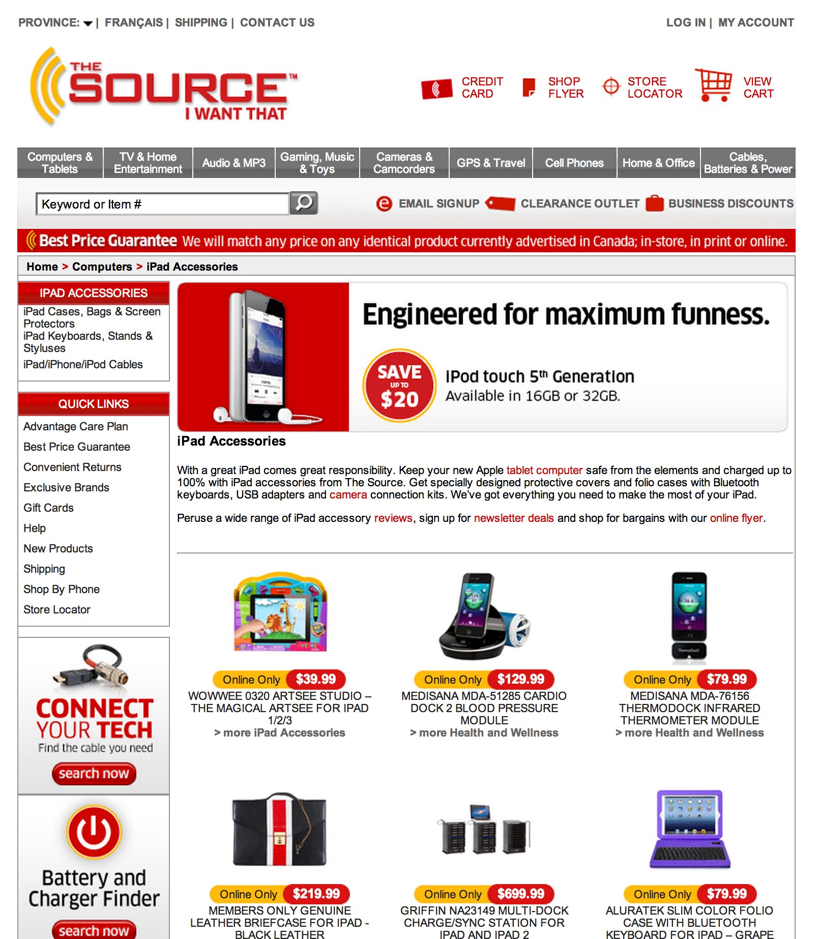
If you look at the display URL you can probably guess what’s about to happen. #ISmellHomepage


ipad-keyboard-lp.jpg


OMFG shoot me now! Why would you do that?! That is the epitome of disrespecting my click and my time.


Fixing this is just as easy as it was last time. Have a headline that says “Ipad Keyboards” and then have a selection of thumbs for the top selling keyboards that click through to a shopping cart page.


Remember, ecommerce landing pages are one of a few exceptions for attention ratio if and only if you maintain a single goal – to buy/order one of a selection of the same thing.


How about an organic search result?


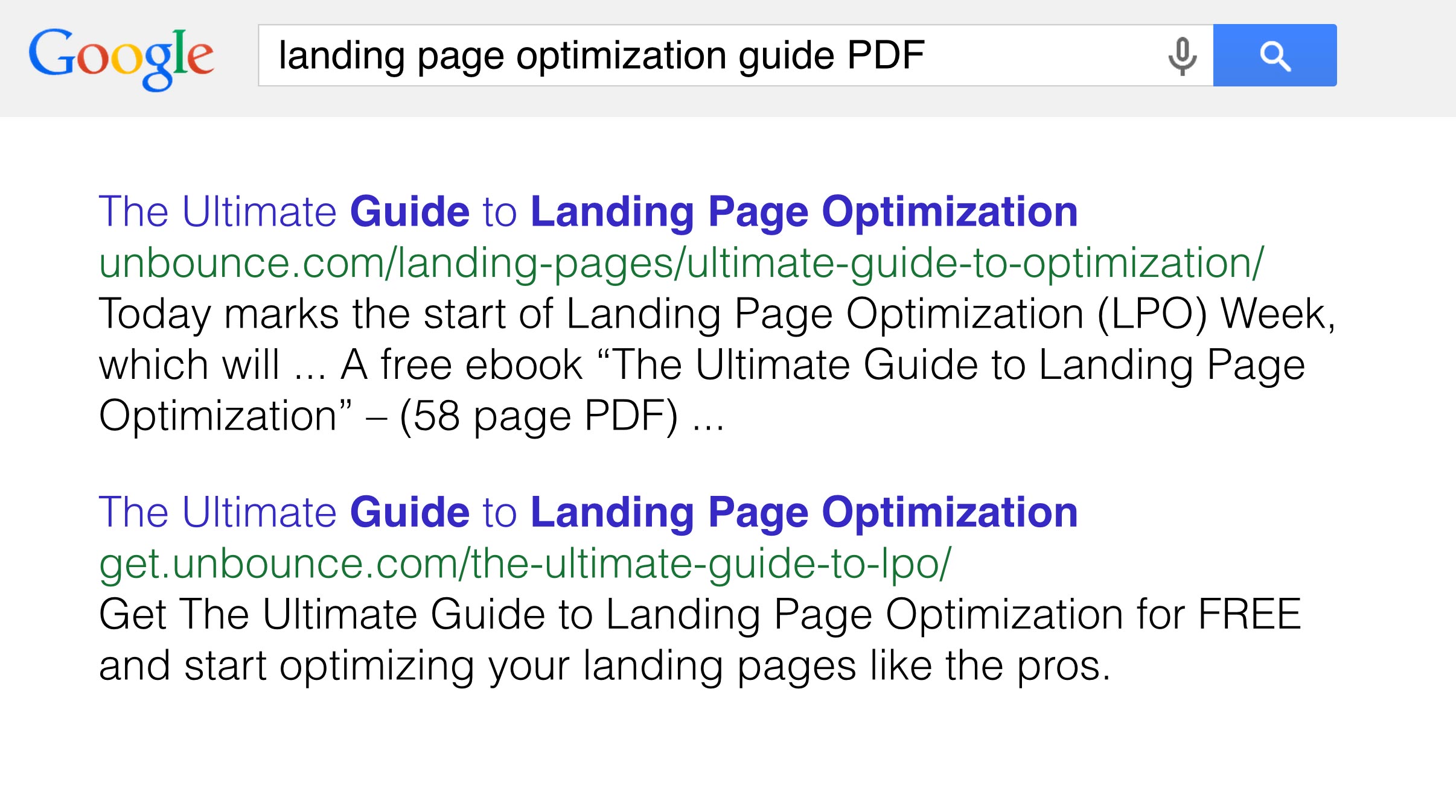
Consider the following search and resulting organic result:


lpo-guide-organic.jpg


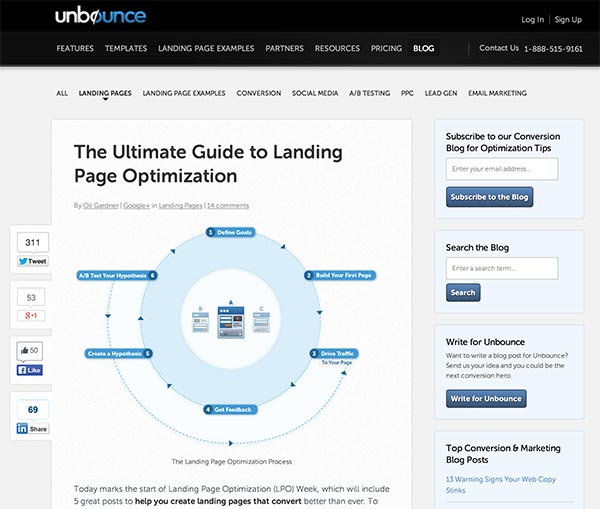
The first goes to a blog post which is helpful, but you need to read or scroll through the post to find a link to the guide, and it suffers from attention ratio problems due to main and secondary navigation.


lpo-guide-blog.jpg


The second result points to a landing page as shown below:


lpo-guide-lp.jpg


That’s a perfect landing experience. Fine, it’s a page that I put together but you can see why it would be effective.


I’m showing this page to demonstrate another scenario where you’d use more than one CTA. The goal of both is the same – to download the ebook. However, the content marketing strategy here is designed to allow alternative social currencies with which to pay for the ebook . First there is the standard email approach which gathers a lead for you. The second is to pay with a tweet.


The purpose of the pay with a tweet option is to let people who are wary of giving up their email get the ebook. At the same time, the goal for the author of the book is to create momentum for the campaign.


Every time a tweet goes out you have the potential to get more people coming back to the page – creating a momentum loop. Clever right?


What isn’t clever is that I neglected to include any social proof on this page. For an ebook, you’ll want to do a search on your social networks to see if anyone tweeted about the ebook. You can then either use that as a testimonial or reach out to the person directly to ask for a more in depth one.


Here’s a search for “SEO research tools”:


seo-tools-ad.png


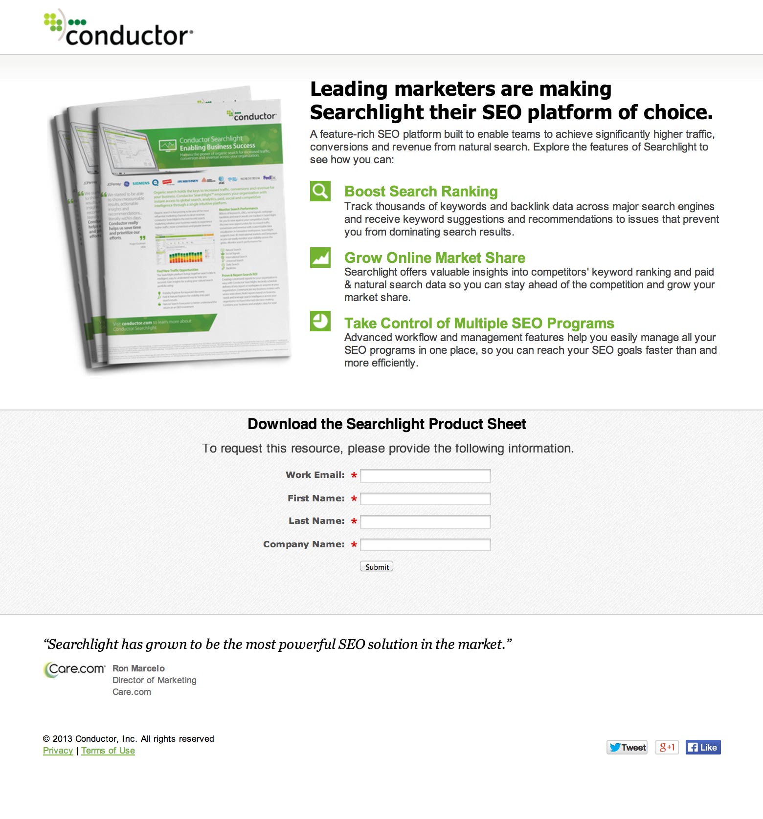
The corresponding landing page looks like this:


seo-tools-lp.jpg


At first glance it looks like a good landing page. However, breaking it down you can see that:


  1. The message match is pretty terrible. It doesn’t repeat the ad at all.

  2. The goal of the page is to download an ebook which wasn’t what I was looking for.

  3. The attention ratio is pretty great. I’d ditch the social share buttons at the bottom as most people will not give a crap about sharing the page at this point. You should ask them to do that on the form confirmation page as we discussed in part 6. Note that for paid search landing pages, it’s often important to include a link to your privacy policy (in the footer) as a trust signal to the ad bots. It can sometimes give your Quality Score a boost.

  4. The CTA is bloody horrible. “Submit” is the single worst CTA copy you can have. It tells you nothing about what is going to happen when you click it. In this case it should be something like “Download my free Searchlight SEO platform product sheet”.

  5. Ideally you’d be using a feature such as dynamic keyword insertion to pass the search keywords through to the page. You could change the headline to read something like this for a better match: “Out of the leading SEO research tools, leading marketers are making Searchlight their SEO platform of choice.”

  6. For the form subhead, the request to fill in the form has zero value to your visitors. As we learned in part 3, you need to tell a story with your form design (as if it were the only element on the page). This subhead content could be used to add an extra benefit statement about what you’ll get from reading this product sheet.


And, we’re done! Feel smarter?


Thanks for reading all the way to the end! I hope you found this guide helpful and entertaining. Learning should be fun after all.


To recap what we’ve learned:


  1. As attention ratio goes down, conversion rates go up.

  2. The stronger the coupling between ad (or any link really) and the landing page it takes you to, the more likely your visitor will be to understand they are in the right place and stick around as a result.

  3. Context is one of the most powerful ways to create an experience that will convert your visitors into customers. Start a conversation before the click and continue it after the click in a personal way.

  4. If you need to show an image/photo of your offering, try to show it being used in practice to show context of use.

  5. For lead gen landing pages, you can design the form as a standalone unit by ensuring it has 6 elements that tell a complete story around your offering. And form love can be a real thing.

  6. The copy on your page is essential to the success of your campaigns, and you should focus the majority of your time on crafting a compelling headline and an actionable CTA that inspires a click.

  7. Remove incongruent words from your page. Particularly when placed close to your CTA. Words like “spam”, “gimmicks” can be detrimental to your conversion rates.

  8. Design is more than the visual treatment of your landing page, it’s about creating an experience that focuses attention on the goal of your page.

  9. Persuasive design will illuminate your failings as a copywriter, which is a good thing.

  10. Always ask for a second conversion on your confirmation pages.

  11. It’s okay to have multiples CTAs only when the page goal is exactly the same for each.

  12. Take a walk through your own ad to landing page experiences and give yourself an honest critique.


Phewf! I’ll leave you with a short story to round out our time together.


I was walking down St. Catherine Street in Montreal (my new home) a few weeks ago, when a man came running up to me, sweating and out of breath.


He stopped and said, “Can you help me!?”


“Sure, what do you need?”


“Do you know ANYWHERE I can get really good chicken right now?!”


Definitely one of the more bizarre requests I’ve had.


If you think about it, this is the real world equivalent of a search query. Now it was up to me to provide a landing experience that solved his problem. I could do this in one of two ways:


  1. “If you go three blocks that way (pointing), then go up 4 and a half blocks, you’ll see a Portuguese place on the right side of the street which has the absolute best chicken in the city.”

That’s a delightful experience, and most likely a customer for life.


  1. “There’s a KFC about 9 miles across town. But it’s closed.”

That’s utterly useless. First I didn’t give him specific enough directions to be helpful, and I ignored a crucial part of his search query. Urgency. Sending someone to a result that can’t result in a conversion is a waste of their time. If I can’t get immediate access to chicken (akin to same-day flower delivery), then I’m going to leave.


#truestory


Alrighty, if you’ve followed along closely, I’ll see you on the other side of more delightful and high-converting landing page experiences. If you feel like sharing some examples from your own marketing in the comments I’d love to discuss them.


From:  https://moz.com/blog/most-entertaining-guide-to-landing-page-optimization


Chapter 7: The art critic - 4 honest landing page critiques

Chapter 6: Please, Internet, I want more conversions

Get this. I’m at a wedding in London in the 70s. I’m 4. My mother turns to the person next to her after noticing I’d wandered away from the table. “I should go grab him!” she says. “Let him play” is the reply.


A moment later, another lady at the table says, “Look at that boy on the stage!” – pointing at a kid standing up there, hands held out in front of him in a bowl shape – “he should be called Oliver.”


“He is!!!” my Mother replies looking horrified.


That actually happened. No word of a lie. I’ll give you my mum’s phone number.


Told you there would be charming anecdotes.


What’s my point? Isn’t it enough that you’re all like “I’m listening to Oliver Twist’s life story!”?


I’ll make it easy for you. You should behave like you are Oliver Twist (me), and ask for something more after every conversion.


When you acquire a lead – when someone fills in your form – the results you can get by asking for more will blow your mind. Or refill your bowl of gruel.


Your marketing doesn’t end with a conversion. Where there is intent there is opportunity.


Post-Conversion Marketing (PCM)


The act of asking for – and getting – more from your leads, is known as post-conversion marketing. It’s the process of continuing the conversation with your new lead on the confirmation page they see after filling out your form.


PCM in action – What should you do?


Imagine this scenario in your head brain.


Dude fills out your form to download an ebook about snowboard designs. You say, “Thanks dude! If you like that ebook about snowboard design, you should come watch our live demonstration of 3D printing snowboard design transfers!”


That scenario can be applied to almost any online business model. You establish interest, then you prompt for a subsequent interaction.


How to use confirmation pages to double your lead gen potential


Here’s a quick and easy case study for you that you can copy to give an instant boost to your lead gen numbers.


We changed the thank-you page for our webinar registration landing pages from asking for a social share, to asking people to subscribe to our blog newsletter.


Here’s the confirmation page in question:


2,500 people registered for the webinar, and of those 40% subscribed to the blog! That’s 1,100 extra blog subscribers just by adding a CTA to the confirmation page of a webinar lead gen form.


Here’s another example of a great confirmation page. In this example, Derek Halpern engages in a conversation and asks people to do 1 or 2 optional tasks. Remember, all you need to do is ask, and you will get some post-conversion conversions.


ThankYouPages-Social-560px.jpg


That’s smart post-conversion marketing! Go do it yourself.


Chapter 6: Please, Internet, I want more conversions

2016年2月22日星期一

Chapter 3: How to make friends forms and influence people

“I f**#ing hate forms! They ruin everything.” — Denis Suhopoljac


That was the reaction from our art director the last time we designed some landing page templates.


Unfortunately, forms are a landing page staple, and because they represent your conversion goal, your ability to understand their nuances is the key to success.


You should remember this statement:


quote-bubble-friction.png


(Tweet this quote)


Friction is the barrier to entry (effort) that your form presents to your visitors. Friction falls into two categories and has one solution:


3.1 Perceived Friction


This is the shock factor of suddenly being faced with a long form. The perception of having to fill out such a long form can be daunting and cause people to change their mind. A solution to this can be to either shorten the form or split your form over more than one page.


3.2 Actual Friction


This is the time and trouble it takes to actually *fill in* the form, and it can cause pretty serious abandonment issues if it’s not considered. Things that can slow down – or cause frustration during – the process of form completion include:


  • Too many open-ended questions that people have to think about.

  • Dropdown menus that don’t include a viable option for the visitor. An example of this is the commonly asked “What industry is your business in?”. If there isn’t an answer available and you don’t provide a way out (like an “Other industry” option) then frustration can occur.

  • Captcha security input fields. This is when you have to read strange looking words or letters and type in what you think they say in order to proceed. Anyone not hate those?


3.3 The solution: reducing friction with conversion lube


You probably thought that was a passing reference. Nope. Conversion lube is whatever you can give to your visitor to ease the transaction.


Method One: Ask the data for help


One approach to improvement is to analyze the results you get and adapt your form accordingly. When looking at your form data, ask yourself:


  • Are a high percentage of dropdown results the first option in the list? If so, you should try to make the answers as short and clearly distinguishable as possible. If people can easily/quickly read the option that applies to them without lots of hunting/scrolling, they will be more inclined to select it.

  • Are the responses to open-ended questions actually real answers? Or are they nonsense (such as “asdfasdf”) designed to get through the form as quickly as possible? If so, you should make the questions more direct and easier to answer. Examples would be: “Tell us about your biggest marketing problem” (requires a short story as an answer) vs. “What is the biggest barrier to your marketing success?” (which could often be answered in a few words like “Not enough traffic.”).


Method Two: Apply some balance


“The prize” is the incentive you offer up in exchange for personal data. Your goal is to balance the size of the prize with the amount of friction.


There are many incentives for a user to give up their personal information: Digital documents: Ebook/whitepaper/report, webinars, newsletters, consultations for professional services, discount coupons, contest entries, free trials, product launch notifications.


The rule here is: Don’t be greedy.


Only ask from your visitors what you would be willing to give up if the roles were reversed.


Okay, be a little more greedy than that, but not much.


For instance, if you will be sending an automated newsletter to registrants, email or email/name are all that’s needed. Whereas if you have a product/service that requires a follow-up sales call, you would want more information to qualify the level of interest, and sometimes extra friction can actually help to remove the looky loos from your funnel and improve lead quality. Like I said, it’s a balancing act.


When in doubt, don’t get ahead of yourself. Remember that you should always start by asking for a kiss before trying to take it a step farther.


I just got a sad feeling.


I don’t think I’ve done enough to make you fall in love with forms.


You should take a trundle over to this page where it’ll all fall into place.


How to design the ultimate lead gen form


Now we’ve covered some of the theory behind forms, you might be wondering exactly how to go about creating a rockstar form. We can do this by designing our form as if it’s the only thing we’re allowed to put on our page.


Your form consists of the following elements:


  1. A headline to introduce the reason for the form

  2. A description with bullets to highlight the benefit and contents of what you’re giving away upon completion

  3. The form with descriptive form fields (original label names and questions can capture attention)

  4. A Call-To-Action

  5. Trust statements or links

  6. A closing urgency or context-enhancement statement

Below is a sketch of how a form designed using this method might look:


Lead Gen Form.png


How was that? All loved up on forms? Not yet? 


Maybe we need some real examples. Below are some examples of lead gen landing pages (#withforms) that I happen to like.


The short and sweet signup form


The ebook download form


The request a callback form floating over a guy’s crotch


The super-long form with a happy guy at the end


#formlove


From: https://moz.com/blog/most-entertaining-guide-to-landing-page-optimization


Chapter 3: How to make friends forms and influence people