Now that you’re a pro landing page optimizer, I’m going to rip into a few bad landing pages so you can see where people are going wrong. To be helpful, I’ll also make suggestions for how to make them more effective.
Here’s a B2C example search that most of you will be familiar with:


The ad is a great match for the search query so we’re firmly on a positive scent trail. Now take a look at the resulting landing page:


Wow. What a train wreck! We have three magic words here. “next”, “day”, “delivery”. Take a look around. The word “next” only appears once on the page and it’s so hidden (top-right corner) that the chances of you finding it are absurdly low.
Attention ratio: Over 120:1
Conversion coupling: “Next day flower delivery” >> “Flowers, Plants and Gifts.” Zero message match.

If you decide to stay on this site you’re going to have to do a lot of work to find what you want.
So how would we go about fixing this broken experience? Take a look at the wireframe below:


Now that’s a simple landing experience. You’re probably wondering why there are 5 CTAs giving an attention ratio of 5:1. Why am I breaking my own rules?
I’m using this example because ecommerce presents a different type of problem and the solution needs to be altered to address this particular circumstance.
The reason why this is a good approach is that there is still a single goal on the page – each CTA represents exactly the same action. The difference here is that you are now segmenting by category while maintaining the goal of the page – to get next day flower delivery.
Breaking down the page, you can see that the search scent is maintained as the headline matches the search query and ad copy perfectly, creating great Conversion coupling. As soon as you arrive on this page, you know you are in the right place.
The subhead backs up the value proposition of the headline, and the question above the flower categories explains the purpose of the CTAs. Once you’ve selected your category you would be pushed through to the category page on the website so you can select the flowers you want to order.
Isn’t that a delightful experience? And it’s so bloody simple there’s no reason not to deliver a page like this to the people who click on your ads.
This can translate to virtually any ecommerce situation.
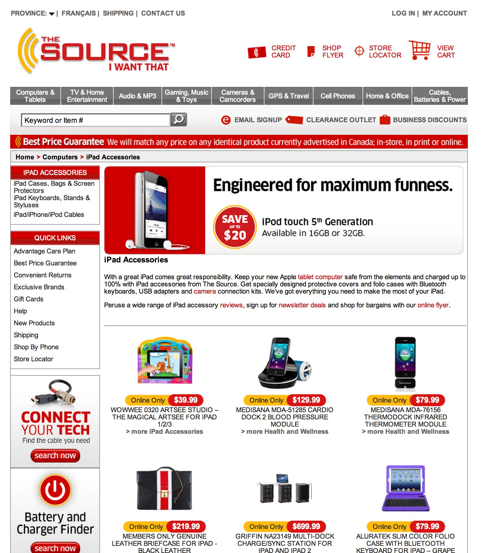
How about a search for “iPad keyboards”?


If you look at the display URL you can probably guess what’s about to happen. #ISmellHomepage


OMFG shoot me now! Why would you do that?! That is the epitome of disrespecting my click and my time.
Fixing this is just as easy as it was last time. Have a headline that says “Ipad Keyboards” and then have a selection of thumbs for the top selling keyboards that click through to a shopping cart page.
Remember, ecommerce landing pages are one of a few exceptions for attention ratio if and only if you maintain a single goal – to buy/order one of a selection of the same thing.
How about an organic search result?
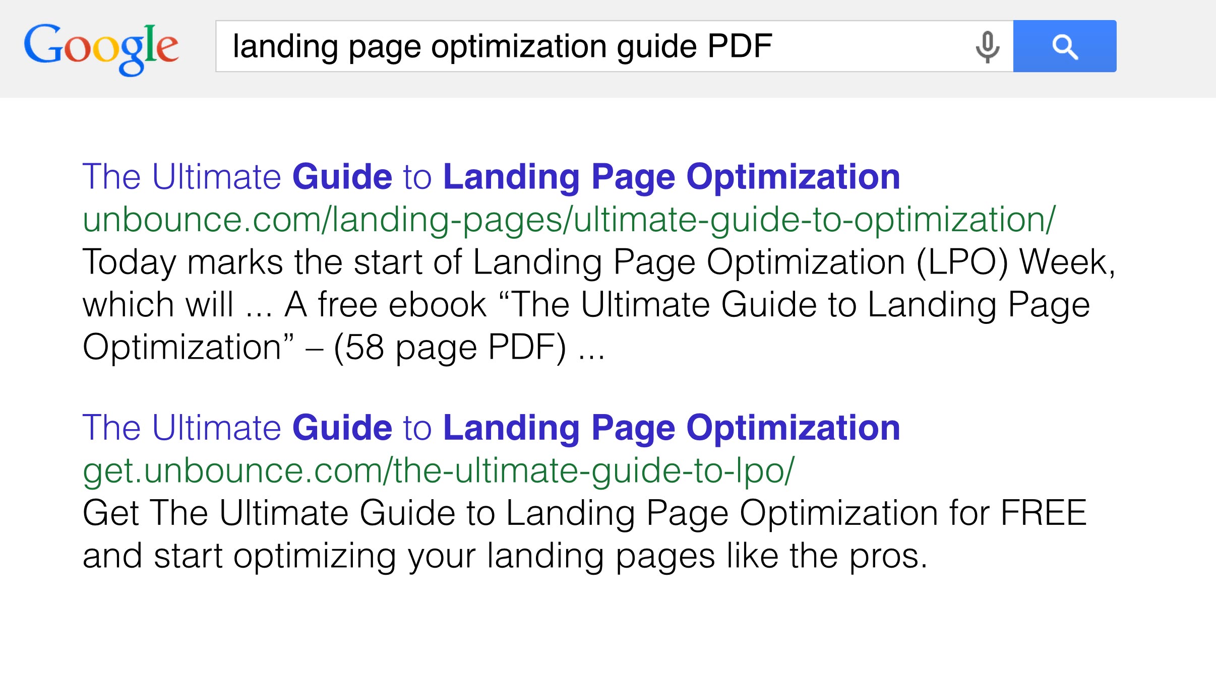
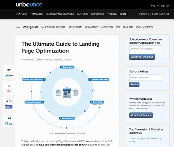
Consider the following search and resulting organic result:


The first goes to a blog post which is helpful, but you need to read or scroll through the post to find a link to the guide, and it suffers from attention ratio problems due to main and secondary navigation.


The second result points to a landing page as shown below:


That’s a perfect landing experience. Fine, it’s a page that I put together but you can see why it would be effective.
I’m showing this page to demonstrate another scenario where you’d use more than one CTA. The goal of both is the same – to download the ebook. However, the content marketing strategy here is designed to allow alternative social currencies with which to pay for the ebook . First there is the standard email approach which gathers a lead for you. The second is to pay with a tweet.
The purpose of the pay with a tweet option is to let people who are wary of giving up their email get the ebook. At the same time, the goal for the author of the book is to create momentum for the campaign.
Every time a tweet goes out you have the potential to get more people coming back to the page – creating a momentum loop. Clever right?
What isn’t clever is that I neglected to include any social proof on this page. For an ebook, you’ll want to do a search on your social networks to see if anyone tweeted about the ebook. You can then either use that as a testimonial or reach out to the person directly to ask for a more in depth one.
Here’s a search for “SEO research tools”:


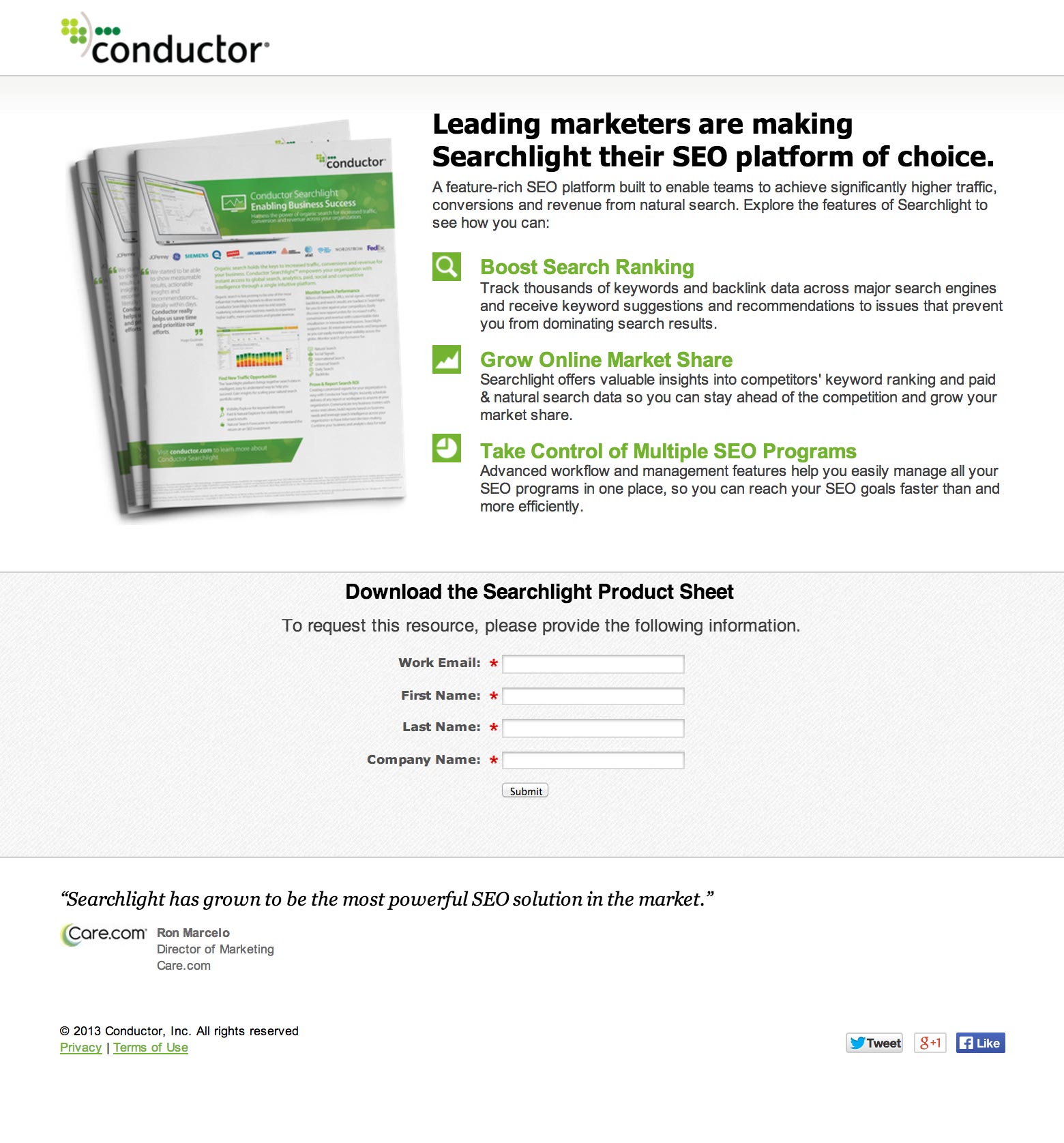
The corresponding landing page looks like this:

At first glance it looks like a good landing page. However, breaking it down you can see that:
- The message match is pretty terrible. It doesn’t repeat the ad at all.
- The goal of the page is to download an ebook which wasn’t what I was looking for.
- The attention ratio is pretty great. I’d ditch the social share buttons at the bottom as most people will not give a crap about sharing the page at this point. You should ask them to do that on the form confirmation page as we discussed in part 6. Note that for paid search landing pages, it’s often important to include a link to your privacy policy (in the footer) as a trust signal to the ad bots. It can sometimes give your Quality Score a boost.
- The CTA is bloody horrible. “Submit” is the single worst CTA copy you can have. It tells you nothing about what is going to happen when you click it. In this case it should be something like “Download my free Searchlight SEO platform product sheet”.
- Ideally you’d be using a feature such as dynamic keyword insertion to pass the search keywords through to the page. You could change the headline to read something like this for a better match: “Out of the leading SEO research tools, leading marketers are making Searchlight their SEO platform of choice.”
- For the form subhead, the request to fill in the form has zero value to your visitors. As we learned in part 3, you need to tell a story with your form design (as if it were the only element on the page). This subhead content could be used to add an extra benefit statement about what you’ll get from reading this product sheet.

And, we’re done! Feel smarter?
Thanks for reading all the way to the end! I hope you found this guide helpful and entertaining. Learning should be fun after all.
To recap what we’ve learned:
- As attention ratio goes down, conversion rates go up.
- The stronger the coupling between ad (or any link really) and the landing page it takes you to, the more likely your visitor will be to understand they are in the right place and stick around as a result.
- Context is one of the most powerful ways to create an experience that will convert your visitors into customers. Start a conversation before the click and continue it after the click in a personal way.
- If you need to show an image/photo of your offering, try to show it being used in practice to show context of use.
- For lead gen landing pages, you can design the form as a standalone unit by ensuring it has 6 elements that tell a complete story around your offering. And form love can be a real thing.
- The copy on your page is essential to the success of your campaigns, and you should focus the majority of your time on crafting a compelling headline and an actionable CTA that inspires a click.
- Remove incongruent words from your page. Particularly when placed close to your CTA. Words like “spam”, “gimmicks” can be detrimental to your conversion rates.
- Design is more than the visual treatment of your landing page, it’s about creating an experience that focuses attention on the goal of your page.
- Persuasive design will illuminate your failings as a copywriter, which is a good thing.
- Always ask for a second conversion on your confirmation pages.
- It’s okay to have multiples CTAs only when the page goal is exactly the same for each.
- Take a walk through your own ad to landing page experiences and give yourself an honest critique.

Phewf! I’ll leave you with a short story to round out our time together.
I was walking down St. Catherine Street in Montreal (my new home) a few weeks ago, when a man came running up to me, sweating and out of breath.
He stopped and said, “Can you help me!?”
“Sure, what do you need?”
“Do you know ANYWHERE I can get really good chicken right now?!”
Definitely one of the more bizarre requests I’ve had.
If you think about it, this is the real world equivalent of a search query. Now it was up to me to provide a landing experience that solved his problem. I could do this in one of two ways:
- “If you go three blocks that way (pointing), then go up 4 and a half blocks, you’ll see a Portuguese place on the right side of the street which has the absolute best chicken in the city.”
That’s a delightful experience, and most likely a customer for life.
- “There’s a KFC about 9 miles across town. But it’s closed.”
That’s utterly useless. First I didn’t give him specific enough directions to be helpful, and I ignored a crucial part of his search query. Urgency. Sending someone to a result that can’t result in a conversion is a waste of their time. If I can’t get immediate access to chicken (akin to same-day flower delivery), then I’m going to leave.
#truestory
Alrighty, if you’ve followed along closely, I’ll see you on the other side of more delightful and high-converting landing page experiences. If you feel like sharing some examples from your own marketing in the comments I’d love to discuss them.
From: https://moz.com/blog/most-entertaining-guide-to-landing-page-optimization
Chapter 7: The art critic - 4 honest landing page critiques
没有评论:
发表评论